THIS ARTICLE MAY CONTAIN AFFILIATE MARKETING LINKS! IN CASE YOU MAKE A PURCHASE THROUGH ONE OF THE LINKS, WE'LL GET A SMALL COMMISSION. WITH NO EXTRA CHARGES TO YOU. THANKS!!
Did you make a design but haven’t published it yet because you are unsure whether the design will work on social media or not? Then this article is for you. Because in this article we will have a learn how to design social media graphics. And provide you with the essential information to get you started.
Table of Contents
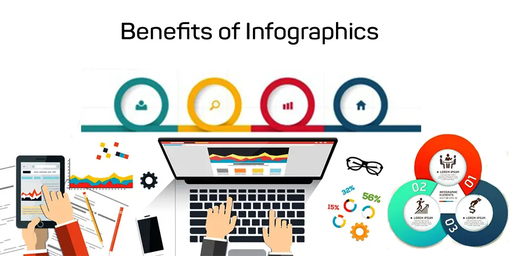
In the article, you will get a checklist of essentials to ensure that your graphic content on social media networks has the impact you desire, hooks clients, and inspires. We are certain that this article will make it less painful to design posts for social media. It will also help you to master the task so it becomes enjoyable. These tips for designing social media graphics will help you design better.
How to Design Social Media Graphics?
1. Use an RGB-colored environment.
Let’s start with the basics. This is how you will create your graphic pieces. Remember that design for social media networks will be done in the RGB color environment.
This is because RGB is the model that is used in all systems formed from light rays (e.g. in digital or audiovisual projections)
Canva states that “monitors and LCD screens, tablets and cell phones display all colors in RGB. Each color you see on a monitor is composed of different percentages of each color.”
We want our colors on the screen to look exactly like they are in the social media templates. Before you begin working, make sure your program is set to RGB. We don’t want to waste our creativity on the best Instagram graphic, only to find that when we try to visualize the colors online, the result is different than what we had in mind by using CMYK.
2. The pixel will be your unit of measurement.
We must use pixels when creating a design in Photoshop, Illustrator, or any other social media design software. For now, let’s forget about meters, millimeters, and centimeters. The pixels are boxes containing the color information of an image. The more pixels, then, the higher the quality. This means that design programs for social media networks can be created with either 8, 24, or 48 bits. Because of its high quality, we recommend 24 bits as the best unit of measurement for creating content on Facebook and Instagram.
3. Use PNG format
Because they have a major influence on the final result of graphic work, we will continue to discuss everything that happens prior to achieving our dream social network design.
We recommend that you upload your images to the internet in PNG format. Transparency is not supported by the JPG format.
The PNG format also has other advantages:
- It allows you to store images with greater quality and transparency.
- It allows for greater compression. This means that you can get a high-quality image at a low weight.
- This makes it easier to see graphic content on the internet.
4. Use color contrast
Now is the time to get rid of that copy of your social media post you have saved. Your text should be placed next to the image. What does this all mean?
These design principles for social media networks will help you better understand it: If you have a light background use dark colors for your text and if you’ve got a dark background use light text. Repeat it several times to ensure you don’t forget! Your image won’t be readable if it isn’t.
Fabian Mocanda says that the best social media designs communicate better than those that are too crowded. This is why color contrast will be so important in information-rich media like Instagram and Facebook.
5. Make a typographic palette
A typographic palette can help you when designing layouts for social media. This will ensure consistency and reinforce branding. It will also help you build familiarity with your clients.
One tip that is worth a lot: don’t design to design. Decide the font used for titles, subtitles, and text blocks. You should be careful about the size of your letter. If it is too large, it can repel others. You are better equipped to understand the importance of details when designing content for social media networks.
Google Fonts has thousands of font options for web design. Many tools are available for community management, which is one of the greatest advantages of this work. Don’t hesitate to use them.
6. Create your color palette
It is just as important to use a color palette for Instagram and other social networks when creating content. This speaks to your brand personality. This aspect should be considered when you develop your social-media management strategy.
7. Choose your images
You’ve probably heard the expression “a picture is worth 1,000 words”. It is a common saying that “a picture is worth a thousand words”. Make it a guiding principle when designing for social media networks. Images or photographs can be the key to your digital engagement.