THIS ARTICLE MAY CONTAIN AFFILIATE MARKETING LINKS! IN CASE YOU MAKE A PURCHASE THROUGH ONE OF THE LINKS, WE'LL GET A SMALL COMMISSION. WITH NO EXTRA CHARGES TO YOU. THANKS!!
Table of Contents
Principles of Graphic Design are the rules that guide and help designers in making an attractive and effective design. Like any discipline, Graphic Design to have a set of rules that work in the dark to create efficient, effective, attractive, and balanced work.
New and upcoming talent tends to go wild with the design elements. For example, they try to use colors that catch their eyes or combine the first five typefaces, believing that they’re making something new and fresh. And often end up with unfinished, plain, or muddled designs. So in order to avoid that one must follow the Principles of Graphic Design.
Let’s learn Principles of Graphic Design
Some of the main Graphic Design Principles are listed below:-
- BALANCE
- ALIGNMENT
- PROXIMITY
- REPETITION
- CONTRAST
BALANCE
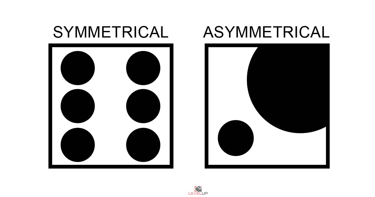
Balance refers to the distribution of design elements (shapes, images, text) in an even manner in the design layout. A good balance of design elements provides structure and stability to a design, through the use of Symmetrical, or Asymmetrical Designs.
- SYMMETRICAL DESIGN:- This type of design are made along the horizontal, or vertical axis, in which case elements are evenly divided into both sides. These designs are very harmonious and traditional, but at times seems boring.
- ASYMMETRICAL DESIGN:- This design type is opposite of the symmetrical design as the name suggests. Asymmetrical designs make use scale, color, and contrast in order to maintain balance and create flow in the design layout. These designs are bolder in nature and bring certain visual interset in the design.
ALIGNMENT
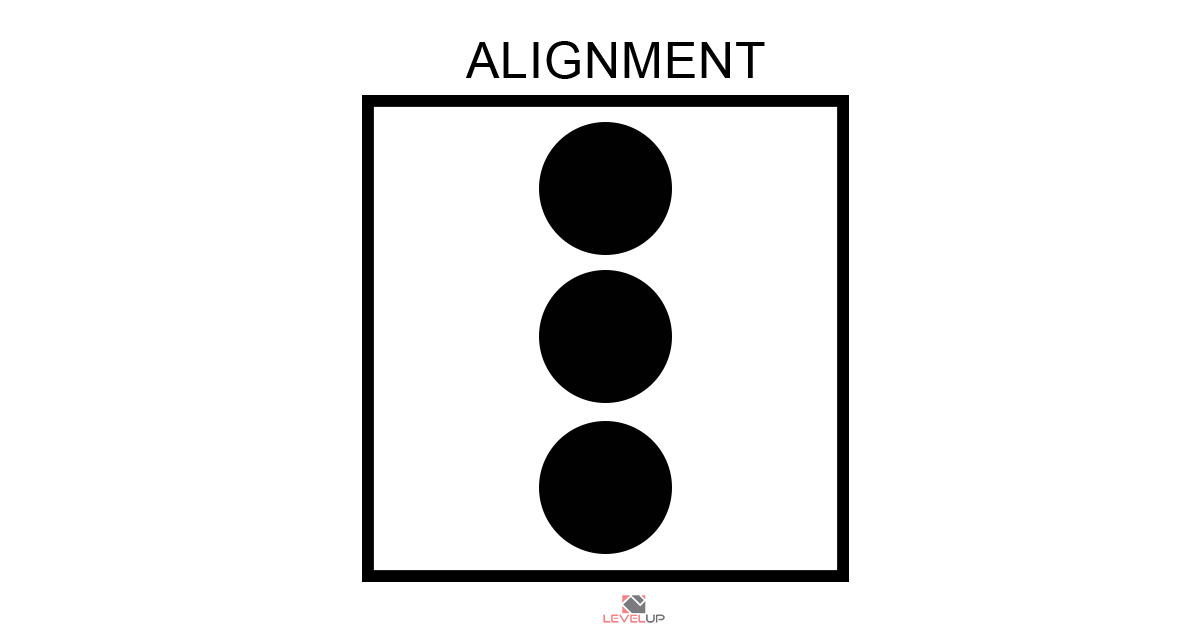
Alignment helps in creating visual connections between design elements used in the layout. It focuses on the representation of each element and maintaining an ordered and sharp appearance. Text alignment is one of the most common uses of Alignment.
PROXIMITY
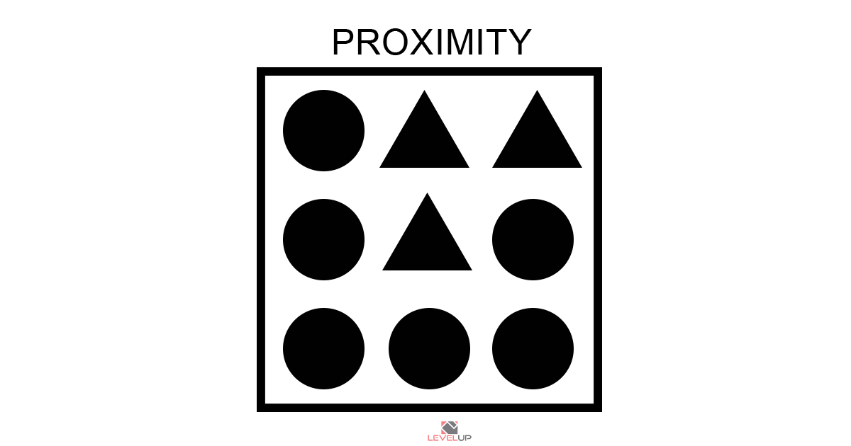
Proximity creates relationships between the same/related elements, thus helping in decluttering of design layout. It organizes the same elements in groups and provides the layout much-needed free space. A common use of Proximity can be seen in lists, invitations, and menus.
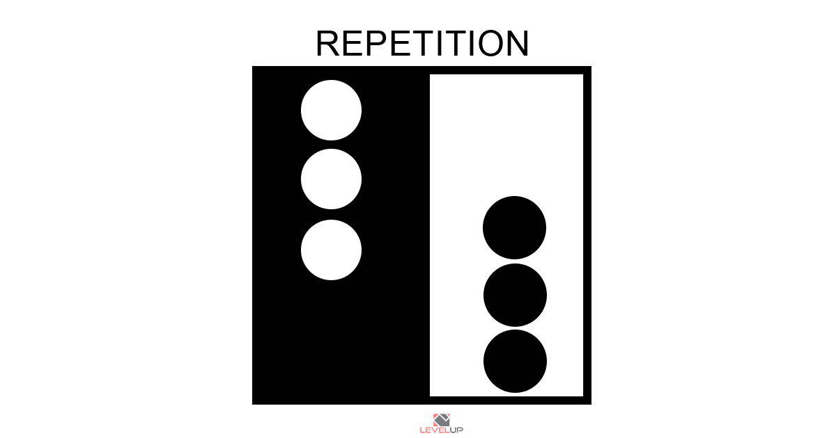
REPETITION
Repetition helps in tying up the overall look of the design by repeating the use of fonts, colors, shapes, or words. It strengthens the design which results in the association between elements in the layout.
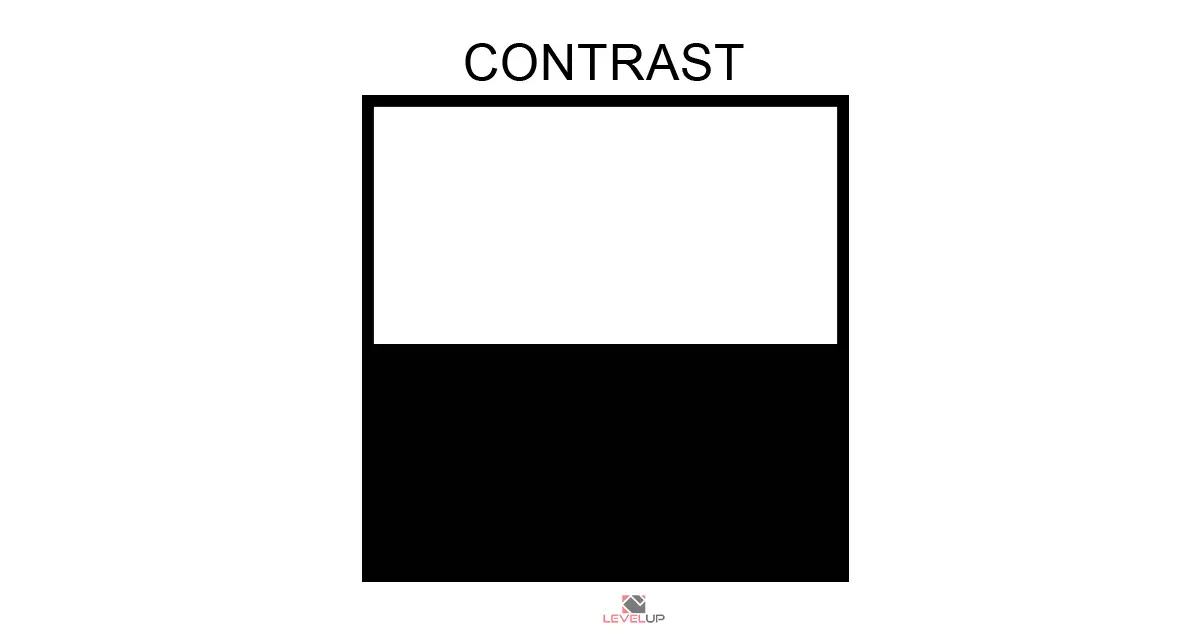
CONTRAST
Contrast is a very important design principle as it helps in guiding the audience’s eyes to key elements of the design. It adds emphasis on elements thus creating impact within the design layout. Contrast happens when two elements are opposite to each other (thick and thin, black and white).