THIS ARTICLE MAY CONTAIN AFFILIATE MARKETING LINKS! IN CASE YOU MAKE A PURCHASE THROUGH ONE OF THE LINKS, WE'LL GET A SMALL COMMISSION. WITH NO EXTRA CHARGES TO YOU. THANKS!!
Table of Contents
- Mastering Color Theory
What is Color Theory? So to answer this question, let’s get started with this quote by Paul Gauguin,
“Color! What a deep and mysterious language, the language of dreams.”
Colors have a profound effect on human psychology as they are able to trigger emotions, send messages, or set the mood of the environment. We see color all around us and in every aspect of our day-to-day life. The use of colors is an essential part of any design or art form out there even if it’s in black and white color. In order to make smart decisions in the use of color, we rely upon Color Theory.
Color Theory deals with the practical guidance system of mixing color and the effects of a specific color combination. In other words, Color Theory creates a Logical Structure for use of color. There are different categories of colors based on the color wheel. These categories are Primary Color, Secondary Color, and Tertiary Color.
Mastering Color Theory
There are various vital elements to Color Theory. Let’s have a look at them:-
First of all, there is Color Mixing System which falls into two categories:
- RGB
- CMYK
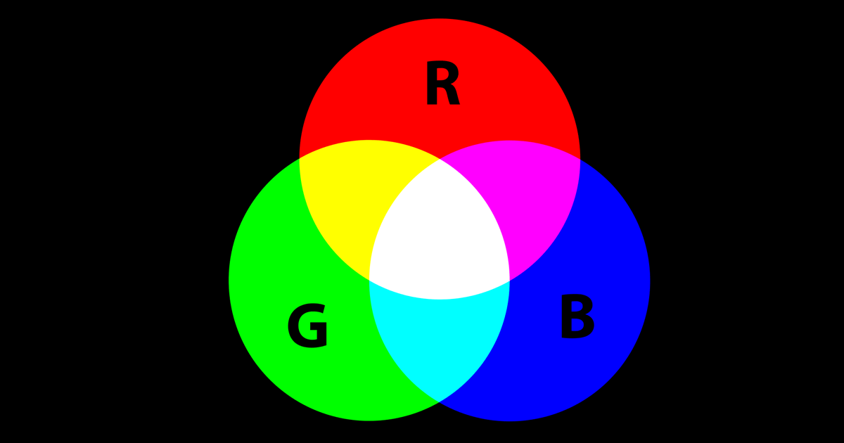
RGB: Additive Color Mixing System
Humans perceive colors through light waves. Mixing Light or additive color mixing allows us to see colors by combining red, green, and blue light sources.
Additive Color Models are used in the testing and design of electronic displays, for example:- TVs, projectors, and screens. These devices use red, green, and blue as their primary colors, and mix them to create other colors.
Where should you use this?
If you are going to post your designs on Facebook, Twitter, or on your website then you should use Additive Color Mixing System (RGB). In short, when working for digital medium or for use on-screen use RGB, not CMYK.
CMYK: Subtractive Color Mixing System
Subtractive Color Mixing is essential about the principle of how inks and dyes are used in printing or on a physical surface. In simple terms, subtractive mixing means that we subtract the light from the object by painting or using color on it.
Before CMYK (Cyan, Magenta, Yellow, Key/Black) traditionally used colors in subtractive mixing were RYB (Red, Yellow, Blue). Due to the emergence of colored printing CMYK has become a staple by replacing RYB. Because CMYK allows printers to make a wider variety of colors on paper.
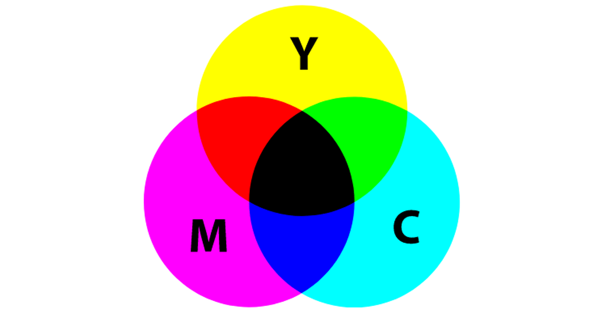
Where should you use this?
If you are going to promote your products and services by printing color brochures and pamphlets. Then, CMYK is the mixing system to go for. Using an RGB mixing system for printing purposes will result in inaccurate colors.
Let’ keep going, next up is The Color Wheel.
THE COLOR WHEEL
A Color Wheel or Color Circle is an abstract representation of Primary, Secondary, and Tertiary colors around a circle. Along with their respective Hues, Tints, Tones, and Shades. This abstract illustration of colors helps in selecting color schemes.
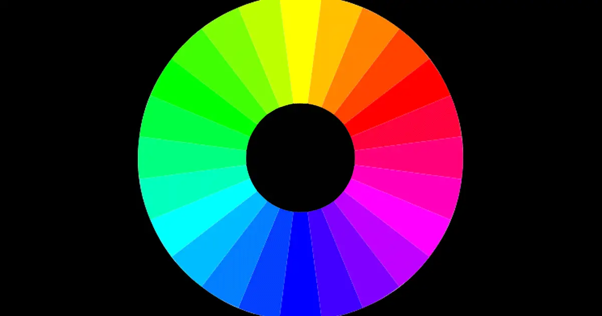
Let’s explore color types used in a Color Wheel,
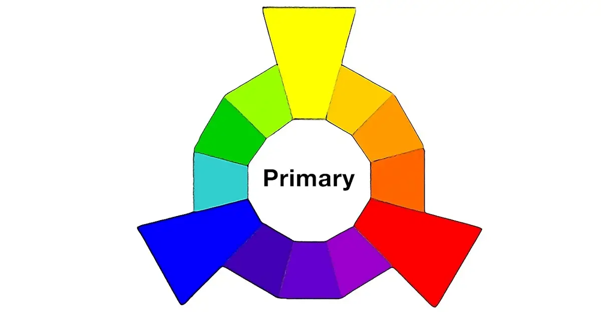
PRIMARY COLORS
In definition, Primary Colors cannot be obtained by mixing two or more colors. They are:-
- RED,
- YELLOW, and
- BLUE
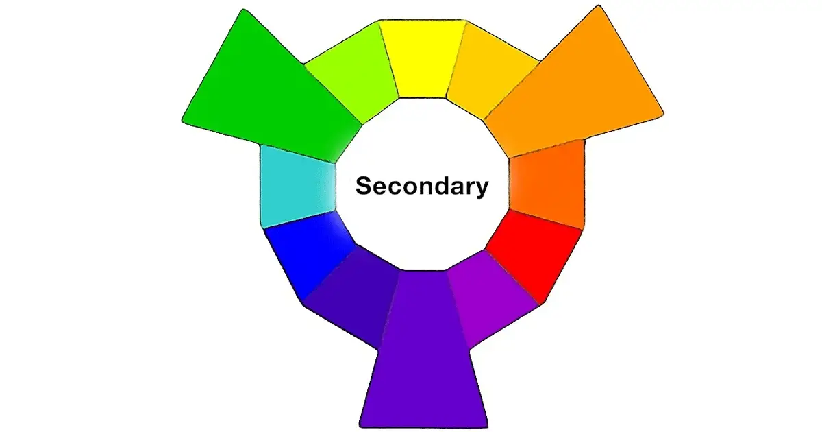
SECONDARY COLORS
Secondary Colors are the colors that are obtained after mixing any two of the primary colors mentioned above. They are:-
- ORANGE (Red+Yellow),
- PURPLE (Blue+Red), and
- GREEN (Yellow+Blue)
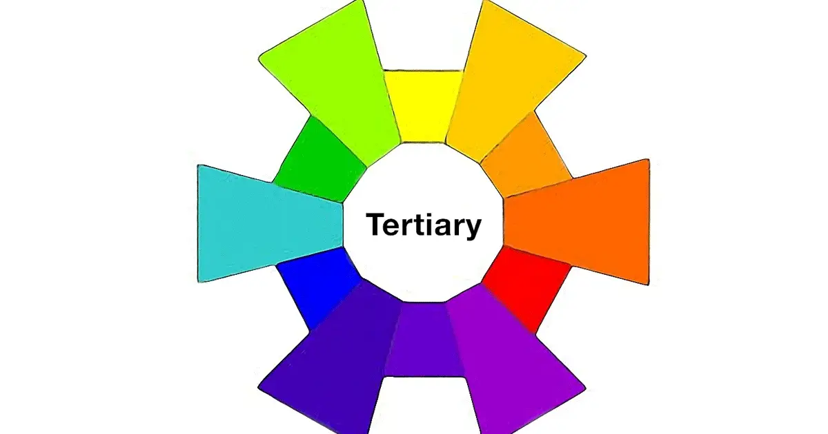
TERTIARY COLORS
Tertiary Colors are obtained when a primary color is combined with a secondary color.
With tertiary color mixing and the making of color gets a little complicated. Because mixing every primary color with secondary color will not result in a new color. For example, Red doesn’t harmonize with Green so their mix will produce a slight Brown color. Likewise, the mixture of Blue and Orange will also result in slight Brown color.
Thus, in order to create a Tertiary color. A primary color must be mixed with secondary color which comes next to it in the wheel. There are six notable Tertiary colors:-
- MAGENTA (RED+PURPLE),
- VERMILLION (RED+ORANGE),
- VIOLET (BLUE+PURPLE),
- TEAL (BLUE+GREEN),
- AMBER (YELLOW+ORANGE), and
- CHARTREUSE (YELLOW+GREEN)
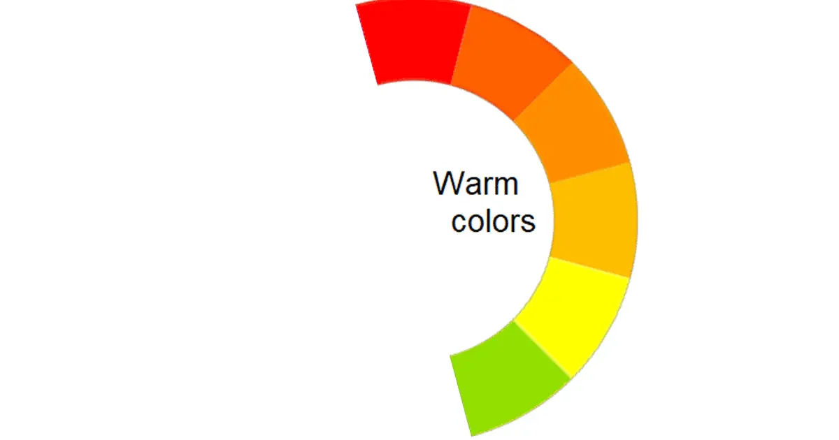
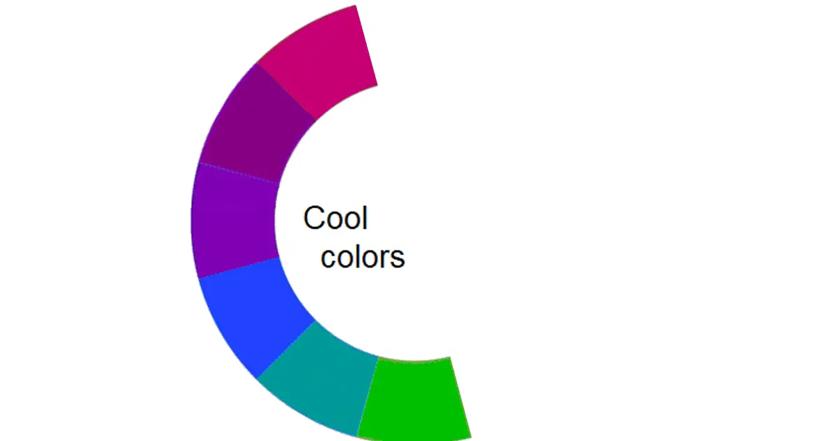
If we draw a line that goes through the center of the Color wheel. And divide the Color Wheel into two halves we end up with two more categorizations of colors, which are:-
WARM COLORS
Warm Colors are usually associated with brightness, action, and energy. (Reds, Oranges, Yellows)
COOL COLORS
On the other hand, Cool Colors are associated with serenity, calm, and peace. (Blues, Greens, Purples)
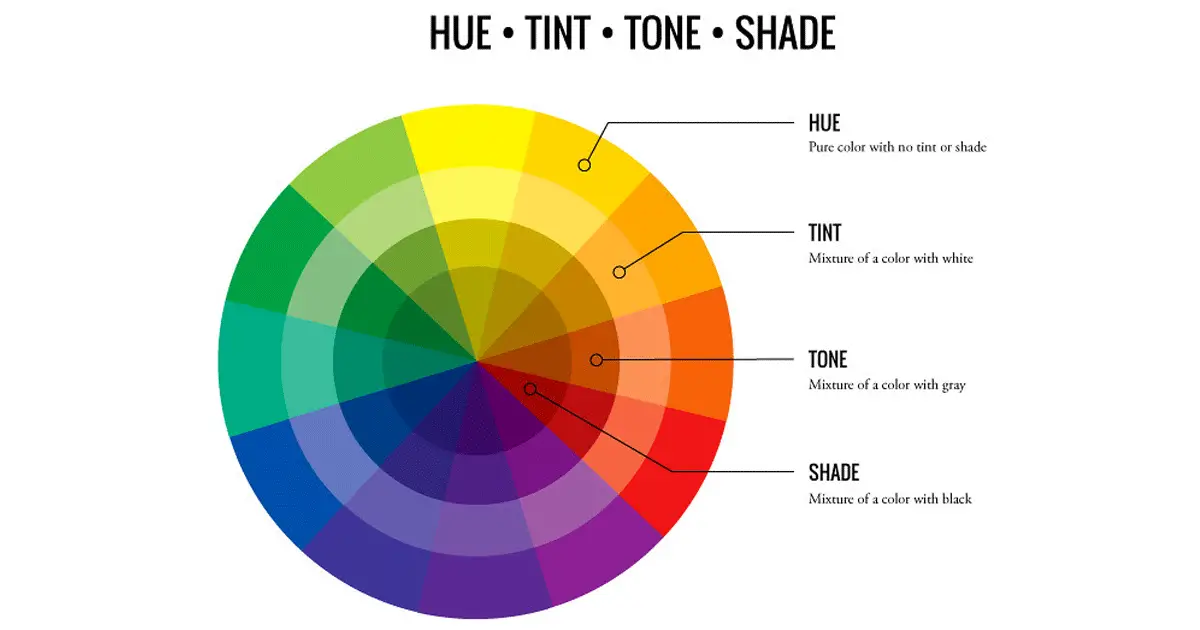
While using the Color Wheel, provides us with the ability to use brighter, softer, lighter, and darker versions of the colors. We get these colors by mixing white, gray, and black with the original colors. These color variants are as follows:-
- HUE:- In general Hue means color. Hue acts as a synonym for the word color. All the colors (Primary, Secondary, Tertiary) in their original for form are Hues.
- SHADE:- Shade of a color means that black is mixed with the hue of that color thus creating a Shade of the color.
- TINT:- Tint means oppposite of shade as in order to get Tint of any color White color is mixed with hue of color.
- TONE/SATURATION:- We get tone in color by mixing black and white, that is gray with the hue. Tone and Saturation means the same but colors used for digital images is oftern reffered as Saturation and for painting word Tone is used.
We have covered a lot of stuff in our quest to answer the question “What is Color Theory?”
While making or working on a new design or art it is possible to use each and every color present on the Color Wheel. But it is not guaranteed that end result will look good. In case of knowing which colors to use in a design, COLOR SCHEMES come to the rescue.
COLOR SCHEMES
These are some of the tried and tested ways of using colors for design and art. Color Schemes help in achieving color harmony in any design or artwork. They are seven major schemes which are:-
- MONOCHROMATIC
- ANALOGOUS
- COMPLEMENTARY
- SPLIT-COMPLEMENTARY
- TRIADIC
- SQUARE
- RECTANGLE
MONOCHROMATIC
A monochromatic color scheme utilizes a single color with varying tints and shades. This scheme creates a consistent feel and look. The main drawback of this scheme is that it lacks contrast, as it ends up looking very polished and clean.
ANALOGOUS
An analogous color scheme is achieved by pairing one main color with two colors directly next to it on the color wheel. Like the Monochromatic scheme, this scheme is also low in contrast and creates softer designs.

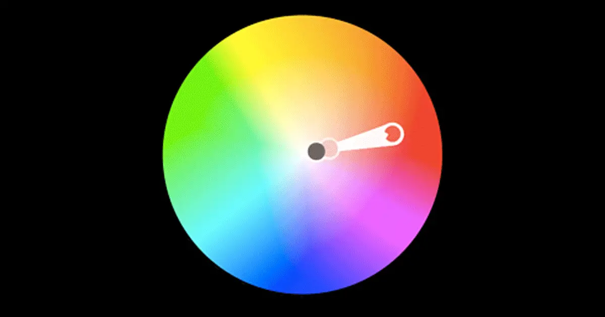
COMPLEMENTARY
A complementary scheme is made by selecting colors directly opposite to each other in the color wheel. This color scheme provides the most amount of contrast in the design.

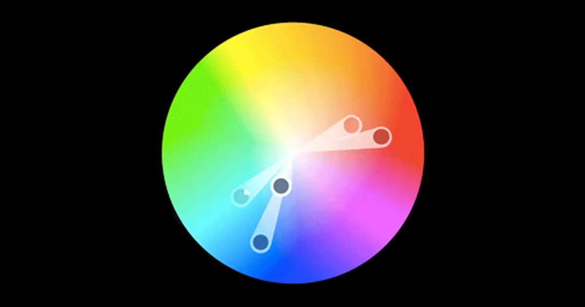
SPLIT-COMPLEMENTARY
A Split-Complementary scheme consists of one dominant color and two directly adjacent colors. This creates a more diverse color palette while having high contrast.
TRIADIC
Triadic color schemes have a high contrast while retaining the same tone in colors. For creating this scheme three colors that are equally placed in lines around the color wheel are selected.

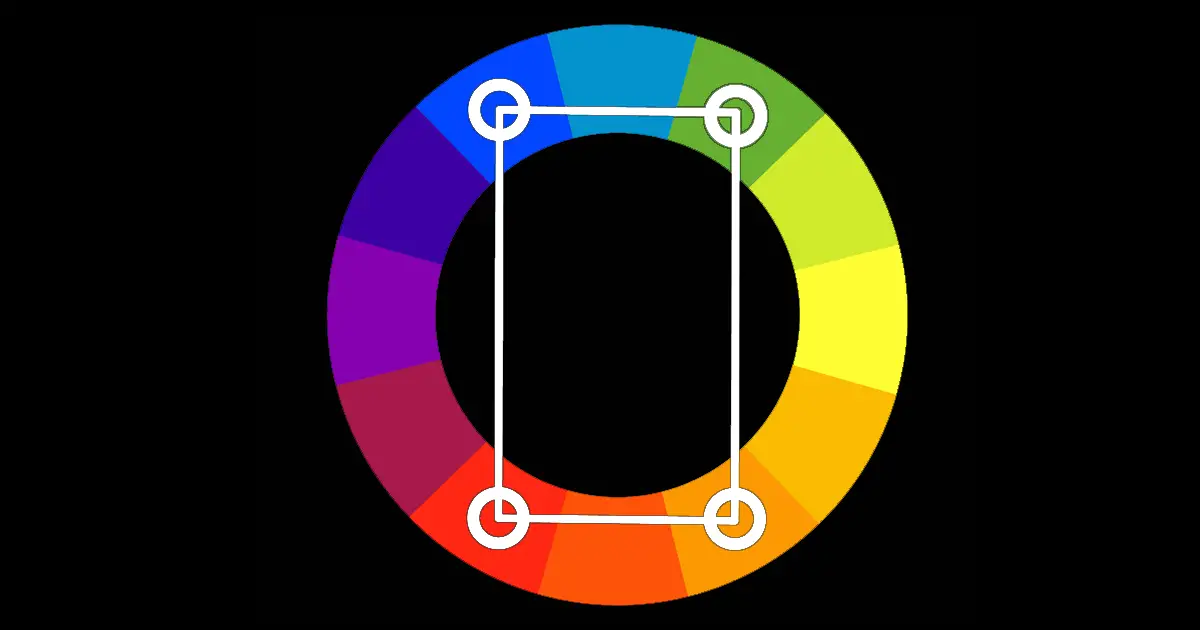
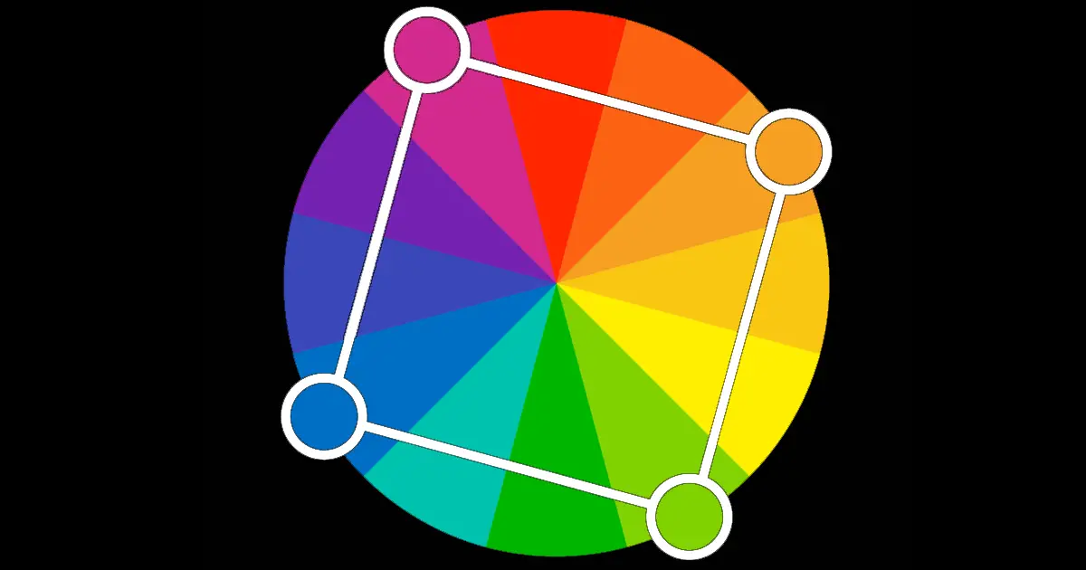
SQUARE
The square scheme uses four colors that are at equal distance from each other on the color wheel to create a diamond or square shape. Remember to select one dominant color in the scheme rather than trying to balance all four.
RECTANGLE
Rectangle color scheme is also called Tetradic Color Scheme, this approach is similar to the square scheme but offers a more subtle color selection.