THIS ARTICLE MAY CONTAIN AFFILIATE MARKETING LINKS! IN CASE YOU MAKE A PURCHASE THROUGH ONE OF THE LINKS, WE'LL GET A SMALL COMMISSION. WITH NO EXTRA CHARGES TO YOU. THANKS!!
Table of Contents
We interact with typography all the time, whether it’s in newspapers, books, mobiles, or websites. Typography is not just about the font. It is a major visual aesthetic that designers use to make connections between the text and its look. With the help of typography different moods, emotions, and atmospheres can be easily expressed in the text. Let’s take a look at the history of typography and learn what’s typography is all about.
Brief History of Typography
The word typography is derived from the Greek words “typos” which means form or impression, and “graphein” which means to write. The origin of typography can be traced back to ancient times when punches and dies were used to make seals and coins. This process later inspired the concept of printing.
Before the invention of modern lead-based movable type, and the invention mechanical press by Johannes Gutenberg in 1439. The first known typography with movable type dates back to the eleventh-century Song Dynasty in China. It was invented by Bi Sheng (990-1051) and was made by utilizing ceramic materials.
With the rapid advancement in technology, typography got revolutionized in the late twentieth century. One of the major breakthroughs in the world of typography was the stand-alone machine that can be used in offices was a typewriter. During the mid-1980s personal computers and the use of graphic design software paved the way for the digital era of typography.
What’s Typography?
At its core typography is the art of type arrangement, including the management of style and font size, spacing, and length of type. The main focus of typography is to enhance the content by making it attractive and easy to read. Typography is used by graphic designers, writers, and art directors to make the text visually appealing and easy to communicate the message. Proper use of typography helps in establishing the brand.
In short, typography is not all about choosing beautiful fonts. It is a vital component of design.
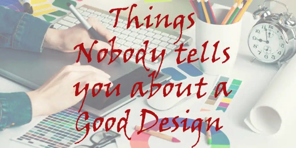
- Things nobody tells you about a Good Design
- Motion Graphics All things to know about it
- What are Branding Elements? An Easy Guide
Elements of Typography
Let’s take a look at the different elements of typography. The main elements of typography are listed below:-
- Fonts and Typefaces
- Different Typefaces
- Leading, Kerning, and Tracking
- Alignment
- Color
- Hierarchy
- Consistency
- White Space
1. Fonts and Typefaces
Fonts and Typefaces are often get confused with one other. And also get referred interchangeably, with being treated as a synonym.
In simple and concise words, Font means the graphical presentation of text characters, whereas Typeface is the family of the related fonts. For example, Helvetica is the name of the entire family of Fonts. Whereas Helvetica Regular, Helvetica Light, Helvetica Bold are the Fonts and members of the Helvetica family.
2. Different Typefaces
Typefaces are further divided into three major types namely, Serif, Sans-Serif, Script, and Decorative. Some examples of mentioned typefaces are as follows,
Serif Typeface example, Times New Roman. Sans-Serif Typeface example, Calibri. Script typeface example, Angelina. And Decorative Typeface example, Curlz MT.
As a rule of thumb designers never use more than three fonts in a design to keep it uncluttered, and appealing. And also keep the use of decorative fonts to a minimum.
3. Leading, Kerning, and Tracking
Leading, Kerning, and Tracking are the aspects that help in determining the spacing in typography.
The space between the lines of text is called Leading. The space between two individual characters is called Kerning. And Tracking is the overall letter spacing of an entire word or passage of text. Proper management of Leading, Kerning, and Tracking is required in order to maintain the ease of reading of the text.
4. Alignment
Alignment plays a major in the unification and cohesiveness of the text and graphics. It ensures that there is plenty of space for text as well as graphics and images in the design while maintaining the readability of the text.
5. Color
Colors are the most important and fun part of the design process. Even though the choice of color for typography is limited in most print media. The digital medium provides a lot of flexibility in this regard.
Getting the right color for the text elevates its message, makes it stand out and makes it more appealing to the reader. Whereas, wrong color selection can make the text unreadable and less appealing.
6. Hierarchy
Hierarchy brings order into the design. It guides the reader and audience through the text and design by emphasizing and distinguishing the text and matter to notice first. Hierarchy can be easily created by utilizing size, color, contrast, and alignment.
7. Consistency
There are so many fonts to choose from that it’s very tempting to use various fonts in a single text, or design. But it can easily make the design messy. So to avoid this problem Consistency is the key. It is essential to be consistent throughout the design. Using consistent colors, text colors, and fonts. A good rule to follow is to avoid using more than three fonts in a single document.
8. White Space (Negative Space)
White Space or Negative Space is a very important part of the design. It is the space all around the design elements. While all the other elements focus on the letters and text. It is the white space that brings cohesiveness to the design by providing readability, and ease of navigation. The audience or reader may not even notice white space until it is too little or too much.