THIS ARTICLE MAY CONTAIN AFFILIATE MARKETING LINKS! IN CASE YOU MAKE A PURCHASE THROUGH ONE OF THE LINKS, WE'LL GET A SMALL COMMISSION. WITH NO EXTRA CHARGES TO YOU. THANKS!!
Thinking about dipping your toes in the world of designing. Then Graphic Designing is the place from you can start. Nowadays everybody needs to use graphic design at some point or other. And having the knowledge to do basic graphic design can come in very handy. If you are interested in learning how to do basic graphic design? Then you have stumbled across the right article as it is about the said topic. Let’s get going.
Table of Contents
How to do Basic Graphic Design?
Graphic design is a skill that can be useful in many areas, both professionally as well as personally.
Imagine you are asked to design invitations for your child’s birthday. If you’re an expert on social media and the designer is not available, you can create your own invitations. Knowing a little bit about design will also be helpful.
Entrepreneurs may not have the funds to hire a professional designer when they start their business. You can help him learn how to make flyers and advertisements.
Graphic design can be utilized in various ways. It is versatile. Anyone working in marketing needs to learn graphic design. It’s easy to design a professional-looking website with the many tools online. Graphic design trends change constantly. There are always new trends in graphic design, just like marketing. When you are creating something, you need to check out what is in fashion. You can make something that is popular, and you can also be inspired by the creations of others.
Online Designing Tools
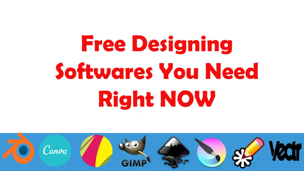
You don’t have to be an expert in Photoshop and InDesign to design. Although they won’t be professional designs, you can still create good graphics using the fundamental concepts that we will discuss later in this article. But there are several options available for free online graphic design programs:
- Canva: This is the most well-known website. It also offers an app and a plugin for WordPress. It’s very user-friendly and offers both paid and free options.
- Piktochart: It’s an intuitive and simple design program. It can be used to create infographics and presentations, as well as designs that you can print out as posters. There are hundreds of templates available, some free and others paid.
- Snappa: Snappa allows you to easily create graphics online. You can choose the dimensions and the templates, then edit them. You can download a lot of stock images for free.
- PicMonkey: PicMonkey allows you to design and edit photos. It’s very simple to use, and you can create posts for ads and social networks. You can try it for seven days free, then you will need to choose one of the payment options.
- Photor: This tool can be used to edit photos and create collages.
Graphic design tips and tricks for Beginners and Amateurs
These tips will help you design the best graphics possible, depending on your goals.
Limit the fonts
Choose fonts that are easy to read and simple for headings, text, and subheadings. Multiple font styles can be difficult to read, so it is best to choose two.
Use one font for title text and one font for body text. It is possible to see chaos if you use more than one font. They make it difficult to read and the design appears too casual.
Consider legibility when choosing a font. It is possible for very nice fonts to be difficult to read, and not work well in your design. He prefers no trimming or embellishments.
It is a good idea to use a stylized font and one that is easily read. You should use the first one with care.
You should also choose letters that match the tone of your brand. For example, if your design is for clothing stores, you shouldn’t use the same font for cleaning services.
- How to do Freelance Graphic Design?
- How to make money as a Graphic Design Student
- Signs you should be a Graphic Designer
Respect the spaces
Text and graphics can focus our attention on a design, but we sometimes forget about the parts that don’t have them. It is important that you allow the design to breathe and distinguish the parts.
White space refers to the area between and around design elements. It is not always necessary that it be of the same shade. In this instance, the recommendation is to not overload the design to allow it to flow well and breathe.
The design will be easy to read and attract attention if there is enough space around the elements.
Sort by Alignment
Good design requires alignment. Software that allows you to design can help you align your lines.
Alignment is important for balance and composition. A line can be used as part of a design to improve its appearance.
You can arrange the images in a grid or frame to make them look more professional.
Colors are important.
A color palette is essential when designing a logo for a company. It should be consistent with the brand’s tone, as different colors can evoke different emotions. Take this example:
- Blue is associated with security, confidence, and relaxation.
- Green is associated with wealth, health, and renewal.
- Red is energy and passion.
- Black is synonymous with power, sophistication, luxury, and elegance.
A tip for graphic designers who are just starting out is to use color psychology in creating logos and websites.
When choosing a color scheme for your business, you should consider having between 1 to 3 primary colors and between 1 to 3 secondary colors. These colors should contrast and complement each other. You can use different colors to maintain consistency and adjust the brightness and contrast.
Simplicity and Clarity
You can achieve contrast by changing the background image’s brightness to let the text colors shine through. This will result in a clear and easy-to-read design. You can choose to have the basic form in white or black.
Design should be simple but not boring. Every element in your design must have a purpose. Use the smallest number of fonts, colors, and shapes.
It’s distracting to leave elements out of your design and it makes it difficult for people to concentrate on what you want to show.
Contrasts enhance the Design
You’ve heard it many times: Opposites attract. This principle can also be applied to graphic design. You shouldn’t use opposite colors, but you can still use colors that appear opposite on the color spectrum.
Contrasting fonts and graphics are also possible. Filters can be used to enhance images. Use dark background color for your font if you have a light background.
The content should be arranged in Hierarchies
The largest elements are the first to be seen when you view a layout. The most important information should be in the largest font to ensure that everyone can see it easily.
For less important information, smaller fonts will be used. Good design can increase conversions.
Follow the Brand Style or Make your Own
It is essential that entrepreneurs create a brand style guide. Everyone who visits the web and its social media networks will notice that there is consistency in visual design.