THIS ARTICLE MAY CONTAIN AFFILIATE MARKETING LINKS! IN CASE YOU MAKE A PURCHASE THROUGH ONE OF THE LINKS, WE'LL GET A SMALL COMMISSION. WITH NO EXTRA CHARGES TO YOU. THANKS!!
Table of Contents
- Tips for Logo Design
- 1. Do the Research
- 2. Get Inspired
- 3. Pick a Style
- 4. Draw some Sketches
- 5. Stick with Black And White
- 6. Keep Proportion and Symmetry in Mind
- 7. Use Space to your Advantage
- 8. Colors play an important role
- 9. Don’t use Generic Typeface
- 10. Use Custom Type
- 11. Keep it Clean, and Simple
- 12. Remember to make it Scalable
- 13. Get a Second, or Third Opinion
If you are looking for tips for logo design, then you may be thinking about making one. Don’t worry this article is just about that. Whether it’s a personal project, or for a client, follow these tips and tricks to get your desired result.
“If, in the business of communications, ‘image is king’, the essence of this image, the logo, is the jewel in its crown.”
– Paul Rand
By reading these words from Paul Rand you can easily determine the importance of a logo. It is the first thing consumer looks for on any given product (consciously, or unconsciously). The logo has a very big part in the identity of a business. It is not merely a symbol used by businesses for identification. Logo plays a main role in a business’s brand and visual identity. Without a logo, a business cannot stand out from its competition. As it is the cornerstone for the brand of any business. Some key points about the logo are,
- Logo is the thing through which consumer indentifies the business, or brand.
- Consumers look for a logo while making a product. So, it is safe to say that Logo has power to drive comsumer’s decision making.
- Logo helps the business to stand out from its competition.
In short, Logo is the first thing that consumers come in contact with, and form their first impression about the brand it belongs to. So, having a great logo that is memorable, simple, impactful, and can convey a clear message, is important.
Due to its immense importance, graphic designers undertake any logo designing project with a mix of dread, fear, pride, and anxiety. So, in order to help you create an outstanding logo, we have made this guide.
Tips for Logo Design
We now know that making a great logo is not an easy task. Here are the Tips for Logo Design for you to help you out in your endeavor.
1. Do the Research

First and foremost, always start the designing process by doing the boring stuff. Doing the essential research and laying down the groundwork is very important it will help you a lot. With proper research, it will be established that the end result will be satisfying. So in order do to research here are some key points to follow and remember:-
- Start with researching about the brand, or business you are creating the logo for. By having the good idea about the the business will enable you to make a design that resonates with the business. For example, if the business is about specialty coffee beans then you can use this information while designing the logo. You can use the word specialty in the logo.
- After getting to know about the business, its time to research about the audience. Audience research is all about knowing the targeted demographic, age, gender, and so on. By the knowing the different aspect of the audience like their educational background, financial background, and so on, you can make sound decisions. For example, if the key targeted audience is not well educated then you can avoid using text in the design and vice-versa.
- At last you will have to research about the competition. The competition research will consist of knowing their color theme, their influence in the market, and so on. But the most important thing will be analyzing their logo. Some things to look in competitions logo are use of color, font, shapes, and so on. By analyzing the competitions logo you will be able to tell which aspect of logo are working and which are not working.
2. Get Inspired

Do not dive headfirst in the designing process without having some inspiration. Having some inspiration will help you generate ideas for the design. Some of the popular ways to get some inspiration are as follows:-
- Browse through sites like Pinterest, Behance, and Instagram, by seeing others designers work your brain is surely gonna fire up. And there will be some designs which will catch your attention. For example, color combinations, graphics, illustrations, font, and so on.
- Now, make a Mood Board, collect all the designs, and ideas you have so far pin them on a actual, or a digital board. By having a mood board you will have all things that got your attention in same place. Whether it is other logo, illustration, color combination, graphics, and so on.
3. Pick a Style
After getting much-needed inspiration it is time for selecting a style for the logo. For this step, proper research comes in handy. You can look around in the market, check what type of style is in trend, and so on. But picking the right style that resonates with the business is very important. There are some popular styles of logo designs to choose from which are as follows:-
Styles for Logo Design
- Classic: Classic logo design have the power to stay timeless and relevant.
- Retro/Vintage: Retro designs have a certain nostalgia with them that makes this style more appealling.
- Modern and Minimalist: Minimalistic designs convey a lot with minimum effort. And they have a touch of modernism with them.
- Fun and Quirky: This style of design goes well with the business whose key demographic are young.
- Trendy: Trendy designs are the designs which comes and goes with the flow of time. They work great when the trend is still going.
- Handcrafted: Handcrafted designs relies on that fact that all the design elements are carefully and meticulously made by hand. This style projects care through its designs.
Along with the desired style, it is also important to know about the types of logos. Below is the list of Types of Logos to help in out in picking a Type to go for.
Types of Logo Design
- Emblem Logo: This type of logo include crests, badges, or seals, in design. With a combination of words and pictures integrated in them. For example, NFL, and Starbucks.
- Letter Mark Logo: This type of logo consist of brand initials. They are all about simplicity. For example, IBM, HBO, and ESPN.
- Abstract Logo: This type of logo are used to express something particular about the brand. For examplae, PEPSI, ADIDAS, and REEBOK.
- Pictorial Mark Logo: This type of logo have a real-world object in the form of a picture, or icon in their design. For example, APPLE, and TWITTER.
- Combination Mark Logo: This type of logo have a both images, and words in their design. For example, PIZZA HUT, and HUAWEI.
- Wordmark Logo: This type of logo are usually font-based. For example, AMAZON, and GOOGLE.
- Mascot Logo: This type of logo have a mascot that represents the brand. For example, KFC, and PRINGLES.
Just try to mix and match the styles, and types of logos with one another to generate cool designs. And find the right combination for the brand or business.
4. Draw some Sketches
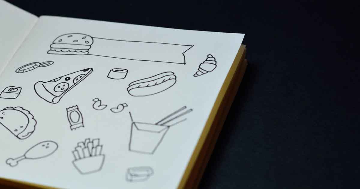
Now, draw some ideas from your inspiration and start doing some sketches. Never head towards the designing software, or tool without having some sketches. By making sketches you will have a clear idea and direction for the design. During this process, you can try out different styles, and types for the design. And experiment with them to come up with the designs which suit the need of the business better. Make a ton of designs and through trial and error, you will make a design that makes sense. And after finalizing a design it’s time to develop the sketch into a logo.
5. Stick with Black And White
When starting to work on the logo in the tool, or software of your choice. It is important to remember to stick with black and white colors only. We will add color to the design as per the requirement. But in the starting phase, working with only black and white helps a lot. Starting out with colors can sometimes overwhelm the designer as well as the client. Because colors can be very distracting sometimes and can deviate the design from its basic concept. Avoiding colors lets you focus on the idea and the details of the design.
So, leaving out the colors for later and working with only black and white is good practice and is important. It should also be noted that if the design is working without colors then indeed it is a powerful design. That works even in black and white.
6. Keep Proportion and Symmetry in Mind
It is also very crucial to keep the proportion, and symmetry of the design consistent throughout the design. Sometimes these things are ignored for creative freedom or creative decisions. For example, in the Nintendo Switch logo, the symmetry of the dots is a little off. But a good rule of thumb is to be mindful of the right proportion and symmetry in the design. Having these two aspects in the design makes the design well balanced with consistent curves, arcs, lines, flow, and on on.
7. Use Space to your Advantage
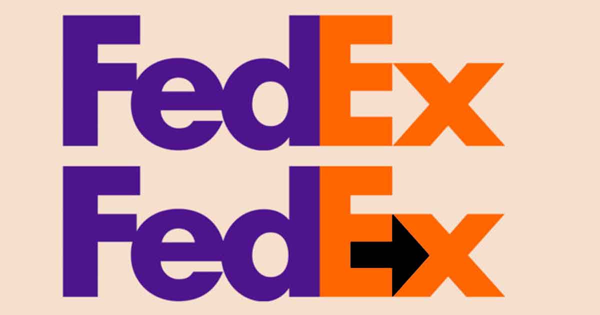
Space in any design is divided into two parts that are, Positive Space and Negative space. In a design, the section, or space with the object in it is referred to as Positive Space. And everything that is surrounding it is called Negative Space.
Playing around with space provides out-of-the-box and visually stunning results. With the proper use of space mainly negative space, you can easily communicate messages in layers. For example, the negative space between the letter “E” and “X” in the FedEx logo forms a Forward Arrow.
So, using the space to your advantage will make the design stand out more. Think about the use of space while designing and try to use it as an element of the design.
8. Colors play an important role
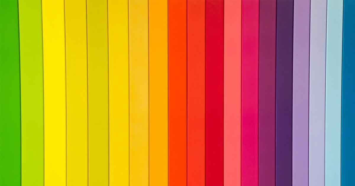
Colors have the ability to convey certain emotions and can affect moods. There is a whole lot of psychology involved with colors and is a big part of Color Theory. Below is a quick rundown of the major colors and the emotions that they evoke.
- RED: Excitement, Anger, and Passion. It indicates that the brand is youthful, loud, aggresive, and want to stand out.
- YELLOW: Cheerful, Youthful, and Affordable. It indicates that the brand is friendly and accessible.
- ORANGE: Playful, Invigorating, and Vibrant. It indicates that the brand is energetic.
- GREEN: Nature, Growth, and Harmony. It indicates that the brand is versatile, and connected to nature.
- BLUE: Trustworthy, Mature, and Serenity. It indicates that the brand is trustworthy, and promotes togetherness.
- PURPLE: Mystery, Luxury, and Imagination. It indicates that the brand is luxurious.
- PINK: Love, Compassion, and Hope. It indicates that the brand is grown up, and youthful.
- BROWN: Handmade, and Aged. It indicates that the brand is supportive, and protective.
- BLACK: Sophisticated, and Independent. It indicates that the brand is minimilastic, and serious.
- WHITE: Peace, Purity, and Cleaniness. It indicates that the brand is complete, and balanced.
Colors have a major role in conveying the brand message. So, the Colors should be used smartly and intentionally. As they are the most stand-out characteristic of a visual identity. Make sure to use bright colors that resonate with the brand, or business identity. The right use of colors will make it stand out, and give a great value and appeal.
9. Don’t use Generic Typeface
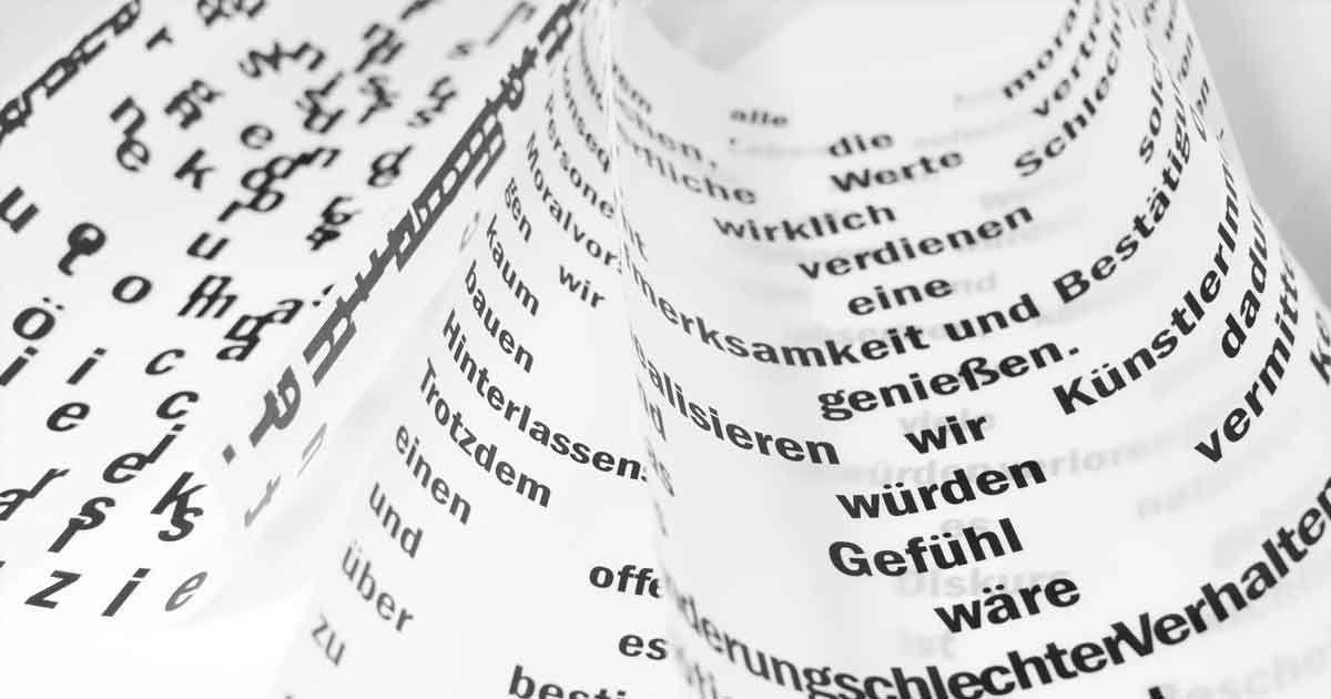
While selecting a typeface for the design, take a brief moment and think about it. Some designers tend to ignore the importance of the right typeface. The typeface also plays a big role in creating a great logo design. As the use of the wrong typeface can break a well-crafted design. On the other hand, the right typeface will add more value to the design. For example, if the logo is for a Rock Band then use bold fonts that give a strong personality to the design.
10. Use Custom Type
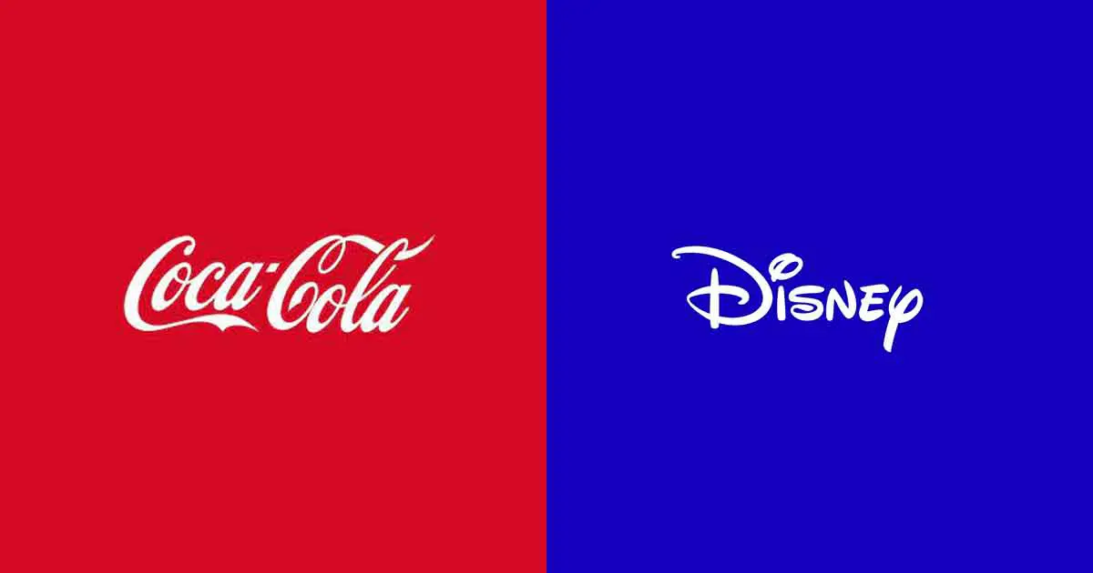
This step is a somewhat extension of the previous one. But it is a step of its own because we are talking about creating a new typeface. If you are not sure about what typeface to use with the design, don’t go looking for it, instead, create a new one. A custom typeface can act as a logo on its own. Some of the popular examples are COCA-COLA, DISNEY, and CADBURY.
Using a custom typeface also keeps the uniqueness of the design intact. As you are not using any pre-made typeface.
11. Keep it Clean, and Simple
Always remember to keep it clean, and simple. As you are looking forward to finalizing the design and the logo. Go over the design once more, analyze it again and make sure that it is clean and as well as simple. Here, we are talking about it both literally, and figuratively.
Some of the most popular logos in the world are very simple and clean even though they are complex in design. For example, APPLE, the logo of Apple just consists of an eaten apple but have you seen the Apple logo from 1976. The 1976 design of the apple logo is complex but at the same time, it is clean and simple.
Try to find and remove the unnecessary elements from the design. If the design is clean and simple it will become more readable and easy to remember. So, a logo should be clean, simple, and memorable.
12. Remember to make it Scalable
The logo of the brand is used for various purposes. For example, it will be used on a business card to banners, advertisements, websites, social media, products, uniforms, and so on. Basically, it will be used everywhere within the domain of the business.
Along with being memorable, a logo should have great scalability. So, a logo should not lose its proportion and elements whether it is placed on a billboard or a promotional product like a pen. The details of the logo must still be visible in both, or any other scenario.
13. Get a Second, or Third Opinion
Always, remember always get a second opinion about your design better yet get a third opinion. Never underestimate the power of someone else’s perspective. A fresh pair of eyes may help you find some key points and mistakes that you may have missed. Or their perspective can be a breath of fresh air that the design requires to reach its full potential. Being open to criticism is a must if you want to improve your design. By getting feedback from others you will be able to avoid misunderstandings, unfortunate shapes, and innuendos in the design.
And that concludes the guide on Tips for Logo Design. Do comment your thoughts and mention the things that we might have missed.