THIS ARTICLE MAY CONTAIN AFFILIATE MARKETING LINKS! IN CASE YOU MAKE A PURCHASE THROUGH ONE OF THE LINKS, WE'LL GET A SMALL COMMISSION. WITH NO EXTRA CHARGES TO YOU. THANKS!!
Table of Contents
- Introduction: What is Typography?
- How Typography for Logo Can Help You Create a Better Logo Design
- Importance of Fonts in Logo Design
Typography is a vital aspect of logo design. Nailing the right typeface for the logo that reflects your brand is very essential. Some of the most famous brands like, Nike, Rolex, Google, and many more express their uniqueness through wordmark logos (typographical). But, before getting to know about how the use of typography for logo design is done. Let’s take a quick look at what typography is.
Introduction: What is Typography?
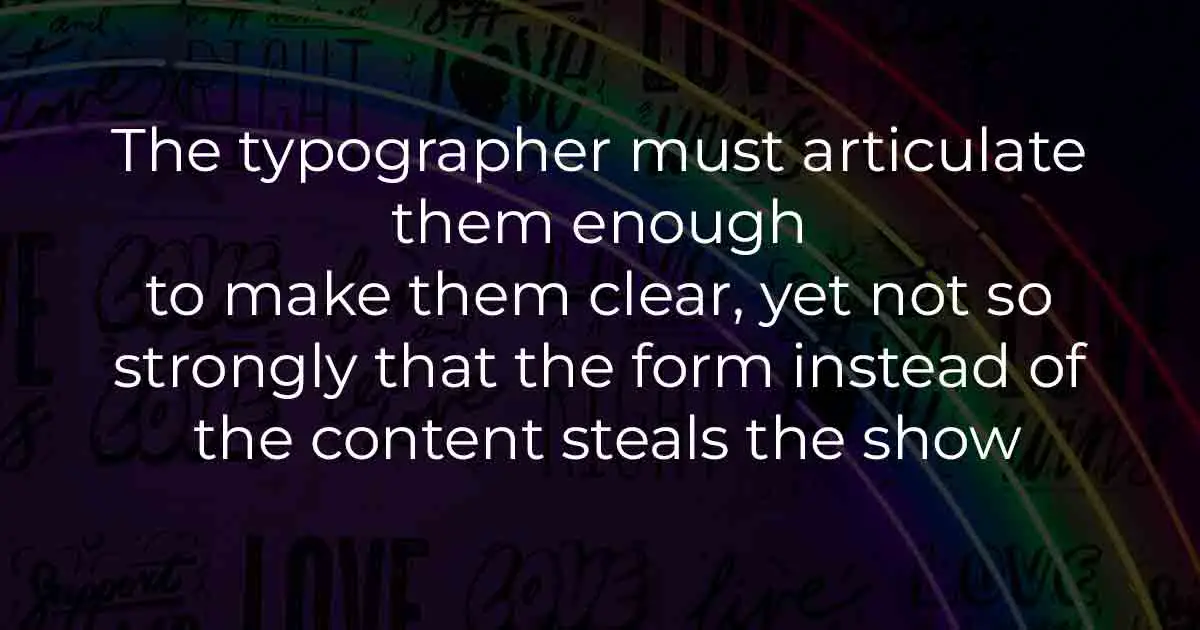
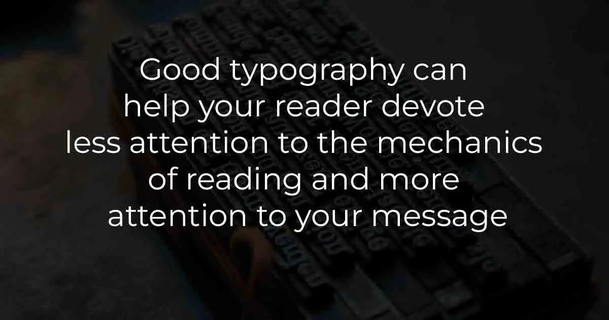
We are surrounded by typography, it is all around us in newspapers, websites, books, advertisements, products, and so on. And to understand the concept of typography in simple words, it is the art, style, appearance, or presentation of text. Typography is all about arranging type to make text readable, clean, and appealing. It involves the selection of typefaces, line lengths, point size, leading(line-spacing), tracking(letter-spacing), and kerning(space between pairs of letters). Typography is a lot of use for professional designers as they can use it to easily convey messages, grab the audience’s attention, build brand recognition, create visual hierarchy, and harmony in the design.
Elements of Typography
- Typefaces and Fonts:- Typefaces are the family of the related fonts. For Example, Helvetica is a Typeface. Whereas, Helvetica Bold and others are Fonts of Helvetica typeface.
- Leading:- The term leading refers to the space between two lines of text.
- Tracking:- The overall spacing of the text is known as tracking.
- Kerning:- The space between two individual characters is called kerning.
- Alignment:- Alignment deals with the placement of text in a cohesive manner while maintaining readability.
- Hierarchy:- The order in which the text should be presented to the reader. Hierarchy is about making the important part of the design stand out.
- Color:- Due to the importance of color psychology the right color selection for the text. Color should convey the intended meaning and should enhance readability.
- White Space:- The space all around the design is called white space. White Space brings the design together and provides ease of navigation to the reader.
- Consistency:- Consistency deals with the idea of using the same fonts consistently throughout the text or design.
- What is Logo & know its Importance and Uses?
- Types of Logo
- Beginners Guide: How to Design My Own Logo?
How Typography for Logo Can Help You Create a Better Logo Design
Having a recognizable and distinct logo is a must for any business or organization. Good Typography provides effective brand recognition and personality to the logo. Along with making the logo design unique, memorable, and appealing to the audience. Some of the most famous brands like Nike, Google, and so on use the wordmark logo, which totally relies on typography. Selecting and finalizing the perfect typography for the logo is not a simple task. In order to properly utilize typography for creating a logo design let’s take a look at the different aspects of typography.
Font Psychology: Hidden Meaning behind Fonts
Most people have heard about the concept of color psychology, and how colors have the ability to convey emotions and affect the way we think and behave. Fonts also have this effect on people and the concept of Font Psychology deals with the fonts and their effect on people. For example, how different inspirational typography generates powerful emotions. Same as colors dictate certain emotions, fonts have specific associations with emotions. We subconsciously react differently toward the way a text is written. For example, if you want to emphasize the creativity of the business Script fonts are the best to select.
Let’s take a look at different Fonts and their hidden meaning,
- Serif Font Psychology:- Want to show the trustworthy nature of the brand, while emphasizing the feelings of class, and heritage. Serif fonts work best for this type of task. Serif Fonts is suitable for academics, editorials, and financial companies. Examples of some famous brands that use Serif Font are The New York Times, Prada, and Burberry. Examples of some famous Serif Fonts are, Times New, Roman, Georgia, and Garamond.
- Sans Serif Font Psychology:- If you want your logo design to look clean, and modern and convey the feelings of honesty, and sensibility. Then Sans Serif Fonts are the right choice. Sans Serif Fonts lack decorative elements which means fewer distracting elements in the design. These fonts are better suited for clothing brands and technology companies. Examples of some famous brands that use Sans Serif Fonts are Intel, Airbnb, and MasterCard. Examples of some famous Sans Serif Fonts are Arial, Century Gothic, and Helvetica.
- Script Font Psychology:- In font psychology Script Fonts are the ones that evoke the feelings of elegance, experience, and creativity. They make the logo design look fancy and artful. Examples of some famous brands that use Script Fonts are, Cadbury, Coca-Cola, and Cadillac. Examples of some famous Script Fonts are Lucida Script, Zapfino, and Lobster.
- Modern Font Psychology:- Modern fonts are best for creating a design that is easy to read and with a modern touch. These fonts are associated with feelings of intelligence, and style. Examples of some famous brands that use Modern Fonts are Facebook, Hulu, and Shutterfly. Examples of some famous Modern Fonts are Matchbook, Klavika, and Politica.
- Decorative Font Psychology:- Display or Decorative Fonts are highly customizable, and unique typefaces. With these fonts, you can easily convey the idea of being casual, fun, or unique. Decorative Fonts can be designed from scratch. Examples of some famous brands that use Decorative fonts are, Fanta, McDonald’s, and Lego. Examples of some famous Decorative Fonts are, Gigi, Bombing, and Jokerman.
Importance of Fonts in Logo Design
The right font can be an integral part of the logo design. It has the ability to make the design timeless. Fonts help in clarifying and establishing the brand identity. For example, A fashion brand will not use the same font as a sporting goods company. The ability to convey emotions makes the fonts a big asset for the designers. With the help of fonts, it is easier to create a beautiful, memorable, and recognizable logo for the brand that conveys the brand identity and also resonates with the audience. One of the best examples of the right use of typography in the logo is the logo of Coca-Cola.